import pathlib
import sys

here = pathlib.Path.cwd()
examples = next(
    p / "examples" for p in [here, *here.parents] if (p / "examples" / "mdm_des").is_dir()
)
sys.path.insert(0, str(examples))

from mdm_des import (
    base_case, build_engine, costs_and_utilities_model, dwell_times,
    load_life_table, parameter_set, states, interventions,
    survival_and_prevalence, with_transition_costs_and_utilities,
)Discrete-event simulation replication
This tutorial shows how to reproduce the published figures of the continuous-time Sick-Sicker discrete-event simulation of Lopez-Mendez and others (2026): competing time-to-event transitions with age-dependent mortality from a life table, a Weibull hazard on time spent Sick, transition costs and utilities accrued over the preceding sojourn, epidemiological outcomes read from the event history, and a probabilistic analysis with expected loss curves.
The model is large enough that its parts live in separate files under examples/mdm_des/. This page loads those parts and shows how they fit together, describing each by what it takes in and returns. Reproducing the figures means matching the companion R code rather than the Table 1 specification on two points, both handled inside those parts: transition amounts accrue over the sojourn that ends in each transition, and six parameters the companion draws but never reads are held at their base case.
Loading the model’s parts
The folder splits the model into files the run script and this tutorial share:
| File | Provides | Takes in and returns |
|---|---|---|
mortality |
load_life_table |
a CSV path to age-specific rates in, a LifeTable out |
model |
build_engine |
the life table, model structure, horizon, discount rate, and population in, a configured continuous-clock MicrosimModel out |
parameters |
states, interventions, base_case, parameter_set |
no input, the model structure and the probabilistic distributions out |
transitions |
with_transition_costs_and_utilities, costs_and_utilities_model |
outcomes and the event history in, outcomes with the sojourn-accrued transition amounts out |
outcomes |
survival_and_prevalence, dwell_times |
the event history in, epidemiological curves and mean sojourns out |
The engine calls two functions the model file builds: event_times, which returns the sampled time to each competing transition from the current state, and state_reward_rates, which returns the annual cost and utility of each state. The article’s next-event method is the continuous clock of MicrosimModel: sample a time for each permitted transition, take the earliest, move, repeat. Because competing times are redrawn at every state entry, the Weibull progression draw needs no truncation and each death time reflects the individual’s current age and state.
First put the examples folder on the import path and load its pieces.
Reproducing the base case
The base case is one run at the article’s Table 1 point estimates. load_life_table reads the US 2015 mortality rates from the CSV shipped with the example, and build_engine assembles the continuous-clock engine from the life table and the model structure. run_psa with collect="events" returns both the standard outcomes and the event history, one row per transition, in a RunResult.
The transition amounts are not in the engine’s per-year valuation. The companion code adds each (the onset cost and disutility, and the cost of dying) to the annual flow of the sojourn that ends in the transition, then multiplies by the discounted sojourn length, so the cost of dying enters as its amount per year over the whole final sojourn. with_transition_costs_and_utilities reconstructs that from the event history and folds it into the outcomes. 25,000 individuals keep this page fast; the full script uses 100,000.
from heormodel.cea import icer_table
from heormodel.params import single_draw
from heormodel.run import run_psa

age_start, horizon, discount_rate = 25.0, 75.0, 0.03
SEED = 2
state_labels, intervention_defs = states(), interventions()
intervention_names = [s.name for s in intervention_defs]
life_table = load_life_table(examples / "mdm_des" / "data" / "us_mortality_2015.csv")

engine = build_engine(
    life_table=life_table, states=state_labels, interventions=intervention_defs,
    age_start=age_start, horizon=horizon, discount_rate=discount_rate,
    population=25_000,
)
base = single_draw(base_case())
base_run = run_psa(engine, base, seed=SEED, collect="events")
outcomes = with_transition_costs_and_utilities(
    base_run.outcomes, base_run.events, base, n_individuals=25_000, discount_rate=discount_rate
)
events = base_run.events
icer_table(outcomes).round(2)| cost | effect | inc_cost | inc_effect | icer | status | |
|---|---|---|---|---|---|---|
| intervention | ||||||
| Standard of care | 128271.03 | 19.69 | NaN | NaN | NaN | ND |
| Intervention B | 203304.96 | 20.92 | 75033.93 | 1.23 | 61099.13 | ND |
| Intervention A | 219446.92 | 20.41 | NaN | NaN | NaN | D |
| Intervention AB | 285971.26 | 21.75 | 82666.29 | 0.83 | 99202.39 | ND |
The frontier runs standard of care, then B at about 59,000 dollars per quality-adjusted life-year (QALY), then AB at about 99,000; A is dominated. The costs, near 128,000 dollars for standard of care up to 285,000 for AB, match the article’s figure 4A, because the transition amounts accrue over the preceding sojourn: the cost of dying, paid over the long final sojourn, adds about 20,000 dollars per intervention that a once-at-death payment would not.
Reading epidemiological outcomes from the event history
survival_and_prevalence turns the event history into the article’s figure 3: it counts state occupancy over time, then returns survival (one minus the dead-state occupancy) and the prevalence of disease among the alive, each a table indexed by time with one column per intervention. Interventions A and standard of care share transition dynamics, as do B and AB, so their curves coincide.
from matplotlib import pyplot as plt
from heormodel.report import intervention_colors

survival, prevalence = survival_and_prevalence(
    events, states=state_labels, interventions=intervention_names, initial_state="H",
    dead_state="D", disease_states=("S1", "S2"), n_individuals=25_000, horizon=horizon,
)

colors = intervention_colors(intervention_names)
dashes = {"Intervention A": (4, 2), "Intervention AB": (4, 2)}
fig, axes = plt.subplots(1, 2, figsize=(9, 3.4))
for ax, curves, title in ((axes[0], survival, "Survival"), (axes[1], prevalence, "Prevalence of S1 and S2")):
    for s in curves.columns:
        ax.plot(age_start + curves.index, curves[s], lw=1.8, color=colors[s],
                label=s, dashes=dashes.get(s, (None, None)))
    ax.set_xlabel("Age (years)"); ax.set_ylabel("Proportion"); ax.set_title(title)
axes[0].legend(frameon=False, fontsize=8)
plt.show()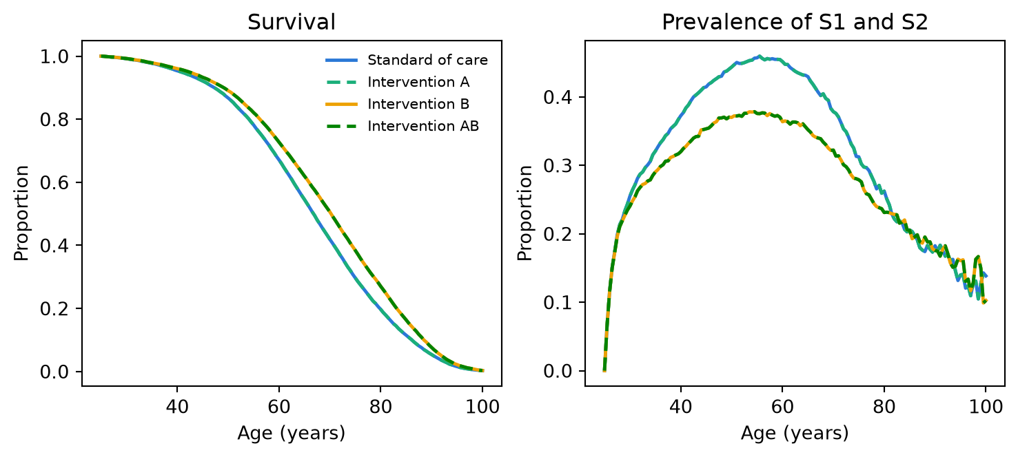
The example’s plot_epidemiology writes this same figure to a file for the run script. Treatment B raises survival by slowing progression into the high-mortality Sicker state, and its prevalence curve peaks lower than standard of care, both matching the article’s figure 3. dwell_times reads the mean completed sojourn per state directly from the event history.
dwell_times(events).round(2)| from_state | H | S1 | S2 |
|---|---|---|---|
| intervention | |||
| Intervention A | 6.26 | 1.63 | 14.51 |
| Intervention AB | 6.21 | 1.71 | 13.77 |
| Intervention B | 6.21 | 1.71 | 13.77 |
| Standard of care | 6.26 | 1.63 | 14.51 |
Individuals spend about 6 years per stay in Healthy, under 2 in Sick, and about 14 in Sicker; B and AB delay entry into Sicker, so those sojourns start older and end sooner, as in the article’s figure 3C.
Running the probabilistic analysis
parameter_set returns the probabilistic distributions. Six parameters the companion draws but never reads are held fixed there to match its figures: the Weibull progression scale, both treatment costs, both transition costs, and the treated-utility increment. With the scale fixed, only the Weibull shape varies, so the progression hazard barely moves across draws.
The transition amounts must be added on every iteration, so costs_and_utilities_model builds a model that collects the event history and adds the amounts in. run_psa runs it over the draw matrix; one draw per run keeps each event history small. The article runs 1,000 parameter sets of 100,000 individuals each; 300 sets of 2,500 individuals keep this page fast.
params = parameter_set()
draws = params.sample(300, seed=SEED)
model = costs_and_utilities_model(
    build_engine(
        life_table=life_table, states=state_labels, interventions=intervention_defs,
        age_start=age_start, horizon=horizon, discount_rate=discount_rate,
        population=2_500,
    ),
    n_individuals=2_500, discount_rate=discount_rate,
)
psa = run_psa(model, draws, seed=SEED, batch_size=1).outcomes
icer_table(psa).round(2)| cost | effect | inc_cost | inc_effect | icer | status | |
|---|---|---|---|---|---|---|
| intervention | ||||||
| Standard of care | 128354.59 | 19.52 | NaN | NaN | NaN | ND |
| Intervention B | 202427.79 | 20.73 | 74073.2 | 1.21 | 61191.34 | ND |
| Intervention A | 218896.39 | 20.24 | NaN | NaN | NaN | D |
| Intervention AB | 284551.39 | 21.56 | 82123.6 | 0.83 | 98585.41 | ND |
The probabilistic means keep the base-case ordering. The acceptability curves, the frontier, and the expected loss curves then summarize decision uncertainty over a willingness-to-pay grid at the article’s 1,000-dollar steps.
import numpy as np
from heormodel.cea import ceac, ceaf, expected_loss
from heormodel.report import plot_ceac, plot_expected_loss

wtp = np.arange(0.0, 200_001.0, 1_000.0)
fig, axes = plt.subplots(1, 2, figsize=(9.5, 3.6))
plot_ceac(ceac(psa, wtp), ceaf_df=ceaf(psa, wtp), ax=axes[0])
plot_expected_loss(expected_loss(psa, wtp), ax=axes[1])
axes[0].legend(frameon=False, fontsize=7); axes[1].legend(frameon=False, fontsize=7)
plt.show()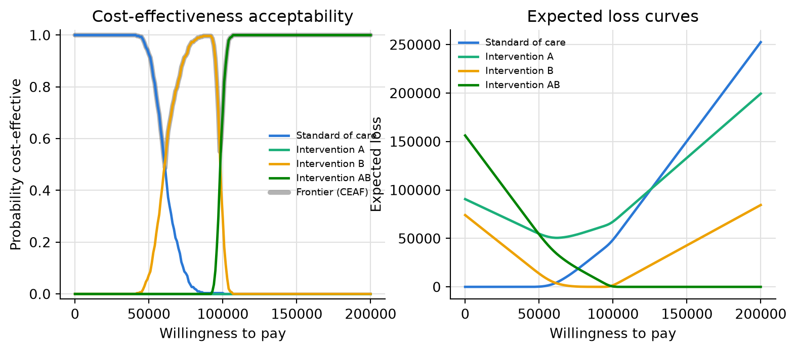
The expected value of perfect information (EVPI) equals the lower envelope of the expected loss curves, so it reads straight off the same money scale. The frontier switches intervention where the lowest curve changes.
from heormodel.voi import evpi

evpi_curve = evpi(psa, wtp)
front = ceaf(psa, wtp)
switches = front["intervention"].ne(front["intervention"].shift()) & front.index.to_series().gt(0)
[(float(w), round(float(evpi_curve.loc[w]))) for w in front.index[switches]]
[(62000.0, 3610), (99000.0, 747)]The frontier switches from standard of care to B near 61,000 dollars per QALY and from B to AB near 99,000, the two thresholds where the article’s figure 4 also places its EVPI peaks. Holding the six companion-fixed parameters at base case keeps the intervention comparisons near-certain, so the acceptability curves are close to step functions and the EVPI peaks are small, matching the published figure 4D within Monte Carlo error. The one departure left in place is that the companion drives every parameter set from a single shared random-number stream, while this run seeds each parameter set separately; both are unbiased, and a larger population per draw shrinks the difference. See devdocs/replication-notes/mdm-des-departures.md for the full accounting.
Reference: Lopez-Mendez M, Goldhaber-Fiebert JD, Alarid-Escudero F. A tutorial on discrete event simulation models using a cost-effectiveness analysis example in R. Medical Decision Making. 2026;46(5):533-548.